Silver Mirror
Seamless booking flow for a result-driven facial service, from mobile to desktop. view live website︎︎︎
SKILLS
UX research, Wireframe analysis, Visual design, Quality Assurance
TOOLS
Sketch, Invision
UX research, Wireframe analysis, Visual design, Quality Assurance
TOOLS
Sketch, Invision
YEAR / DURATION
2022 / 5 weeks
TEAM—STUDIO SIMPATICO
UI/UX Intern Me
UX Lead Tamara Olson
Head of Design Bruce Viemeister
Visual Designer Angela Huang
Front-End Lead Amber Weinberg
Front-End Developer Zeth De Luna
Project Manager Mingwei Ma
2022 / 5 weeks
TEAM—STUDIO SIMPATICO
UI/UX Intern Me
UX Lead Tamara Olson
Head of Design Bruce Viemeister
Visual Designer Angela Huang
Front-End Lead Amber Weinberg
Front-End Developer Zeth De Luna
Project Manager Mingwei Ma
OVERVIEW
![]()
During the Fall semester of 2022, I worked as a UI/UX design intern at Studio Simpatico, a user-focused product design company. I collaborated with the designers, PMs, and developers to build a launching website for Silver Mirror, a result-driven, on-site facial service brand.

During the Fall semester of 2022, I worked as a UI/UX design intern at Studio Simpatico, a user-focused product design company. I collaborated with the designers, PMs, and developers to build a launching website for Silver Mirror, a result-driven, on-site facial service brand.
Goal
To design a smooth experience for booking facial service, that take cares of different scenarios and scaleble to mobile & desktop, while making sure the visual and interaction experience is consistent aligning to the marketing website.
Contribution
1. Wireframe analysis and competitor research on booking flow experience.
2. The first design attempt on booking flow— [Step 3] Services, [Step 4] Scheduling, and edge cases.
3. Responsive web design from mobile to desktop view.
4. Applying design system and component creation for booking flow.
5. Quality assurance for several redesigned pages of the marketing site.
Learning from booking flow wireframes
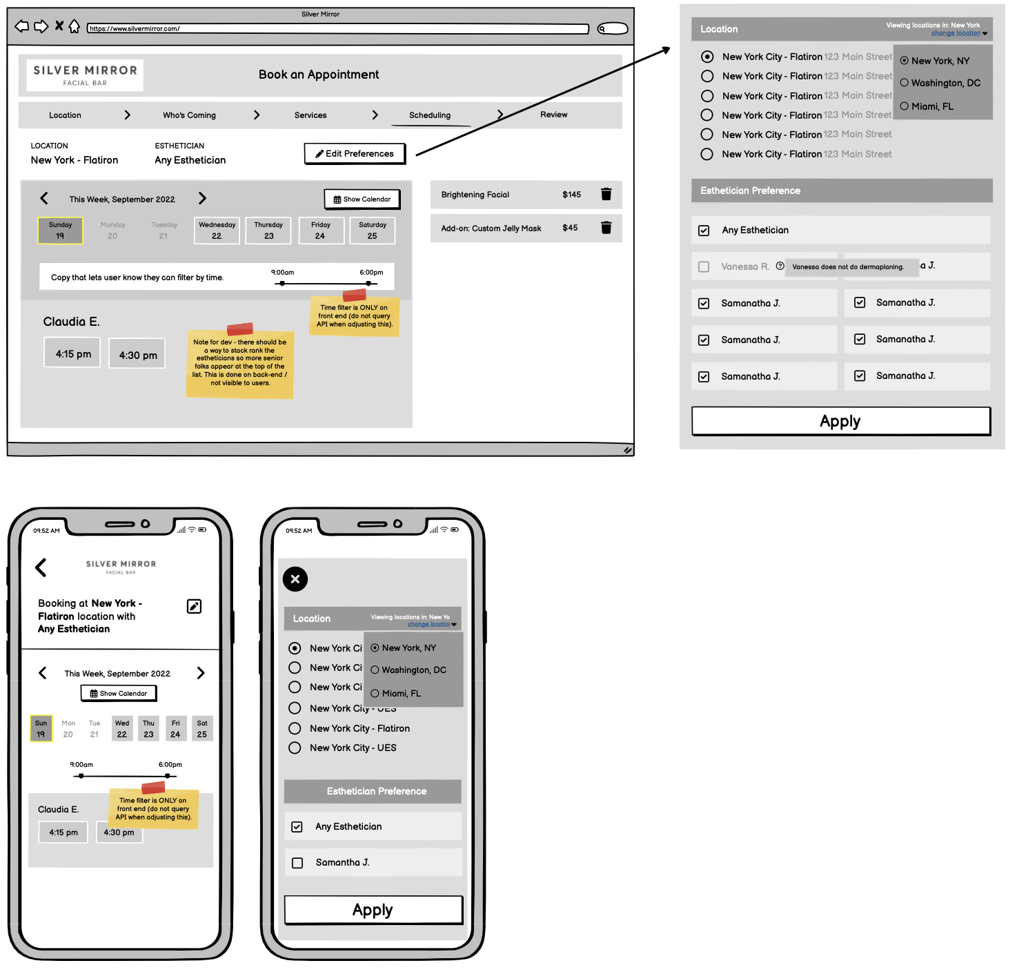
By looking into the ideation wireframes created by our UX researcher, I had a better understanding of how the flow should be designed and what were the decisions behind those wireframes, in order to make refinements.
[Step 3] Services & [Step 4] Scheduling
![]()
![]()
By looking into the ideation wireframes created by our UX researcher, I had a better understanding of how the flow should be designed and what were the decisions behind those wireframes, in order to make refinements.
[Step 3] Services & [Step 4] Scheduling

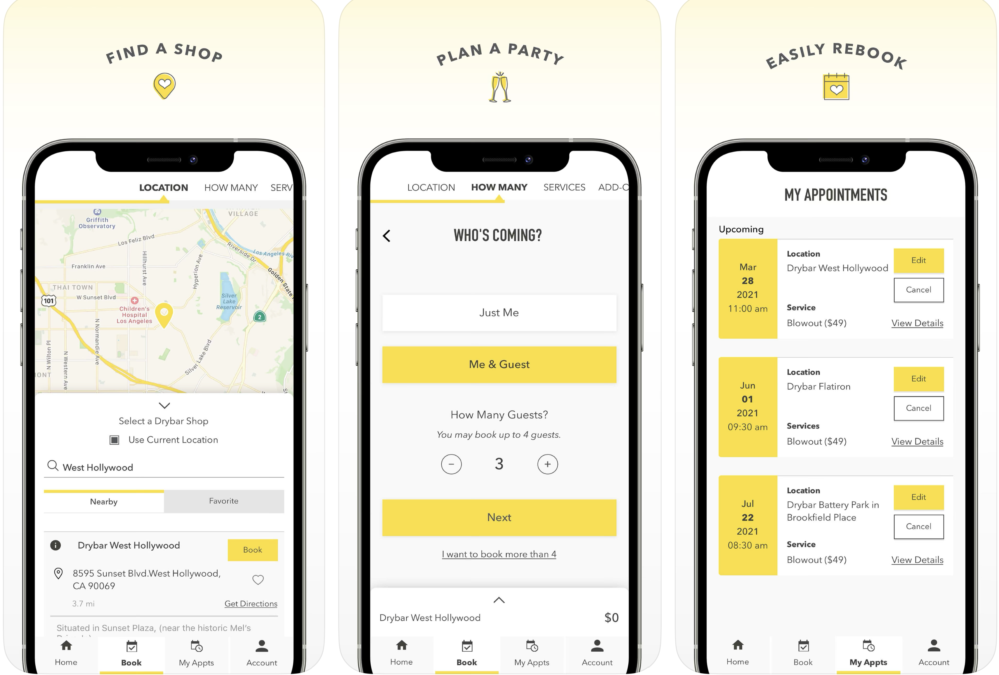
Referencing booking flow from Drybar
We’ve looked into the industry, and other similar flows, food to-go checkouts, such as UberEats or Seamless, and learned how to manage the complexity of informations.
![]()
We’ve looked into the industry, and other similar flows, food to-go checkouts, such as UberEats or Seamless, and learned how to manage the complexity of informations.

2. DESIGN ATTEMPT
Seamless and friendly
Seamless and friendly
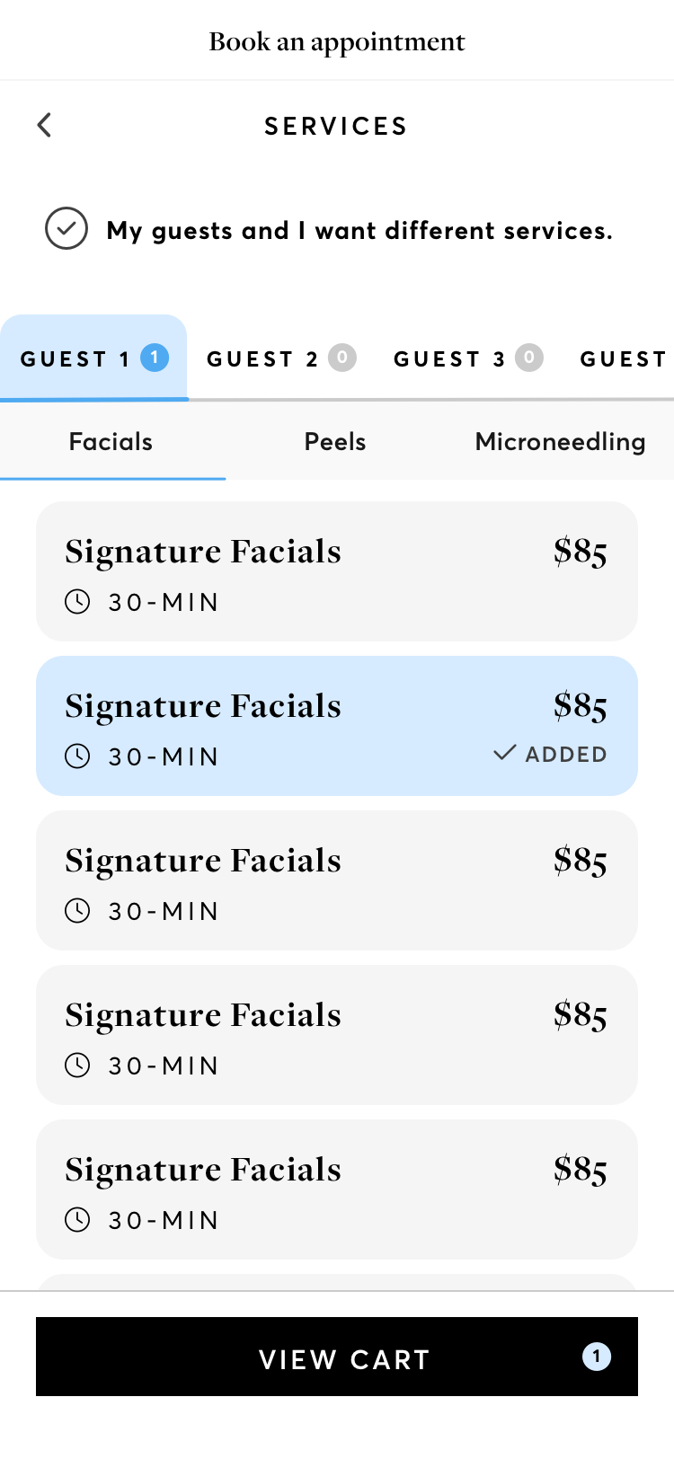
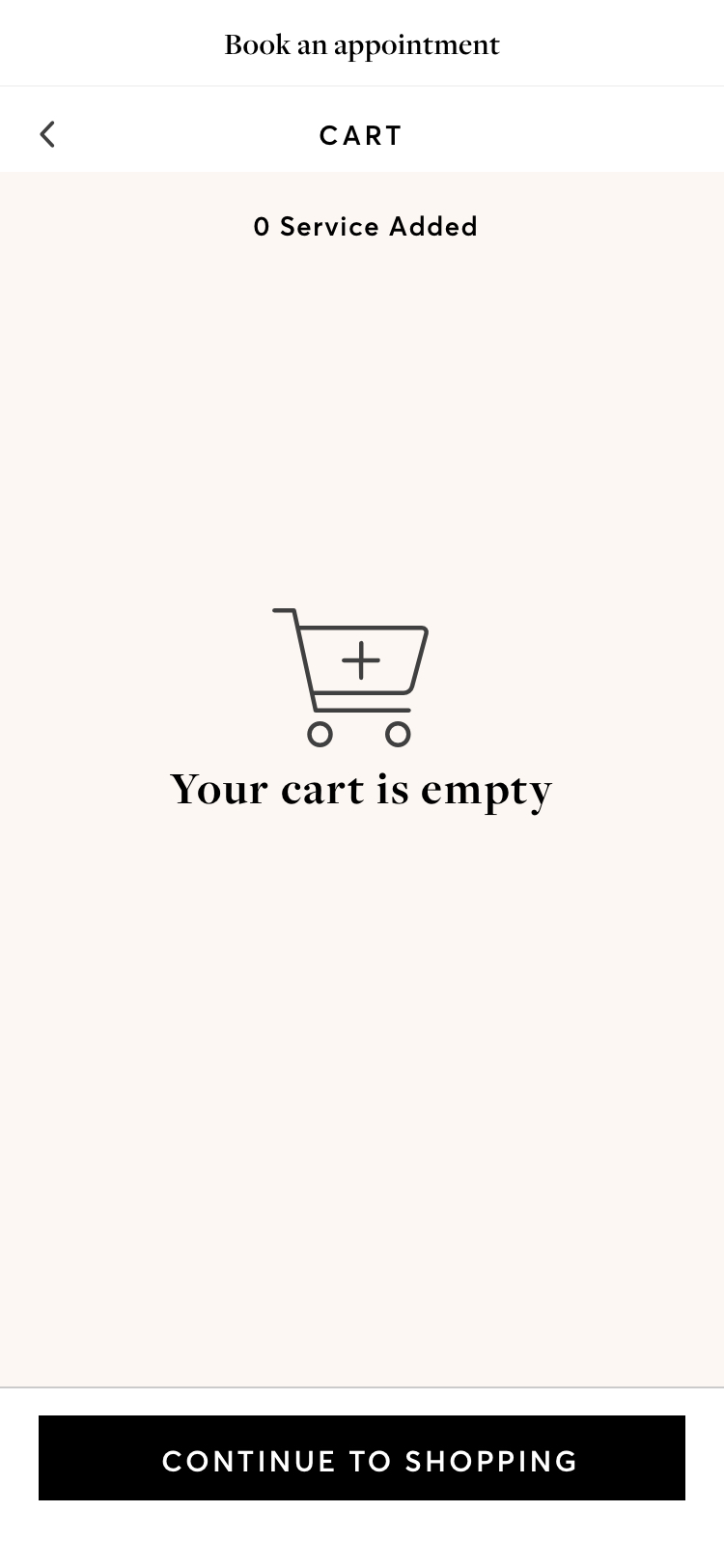
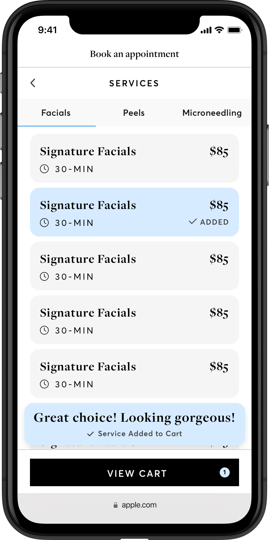
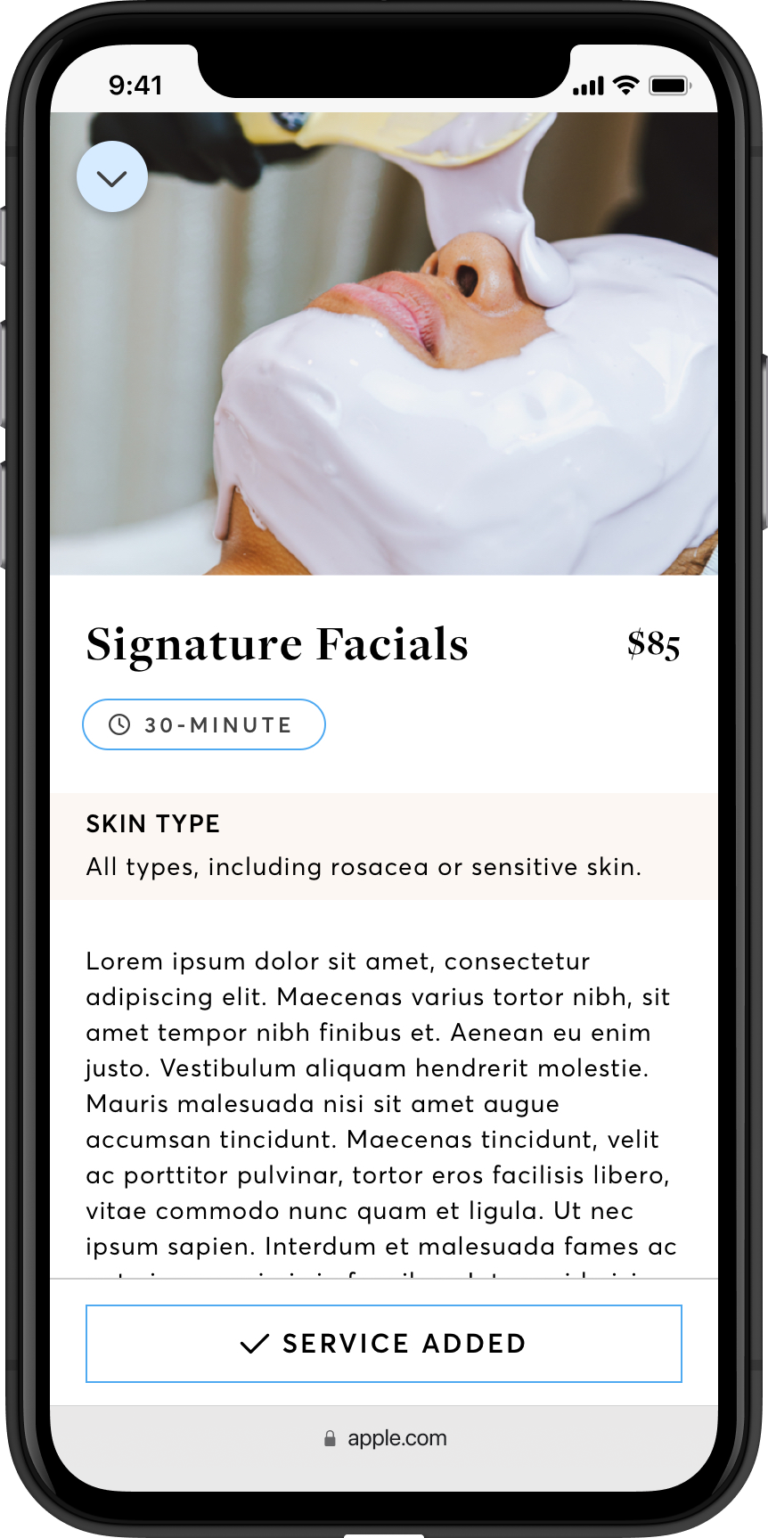
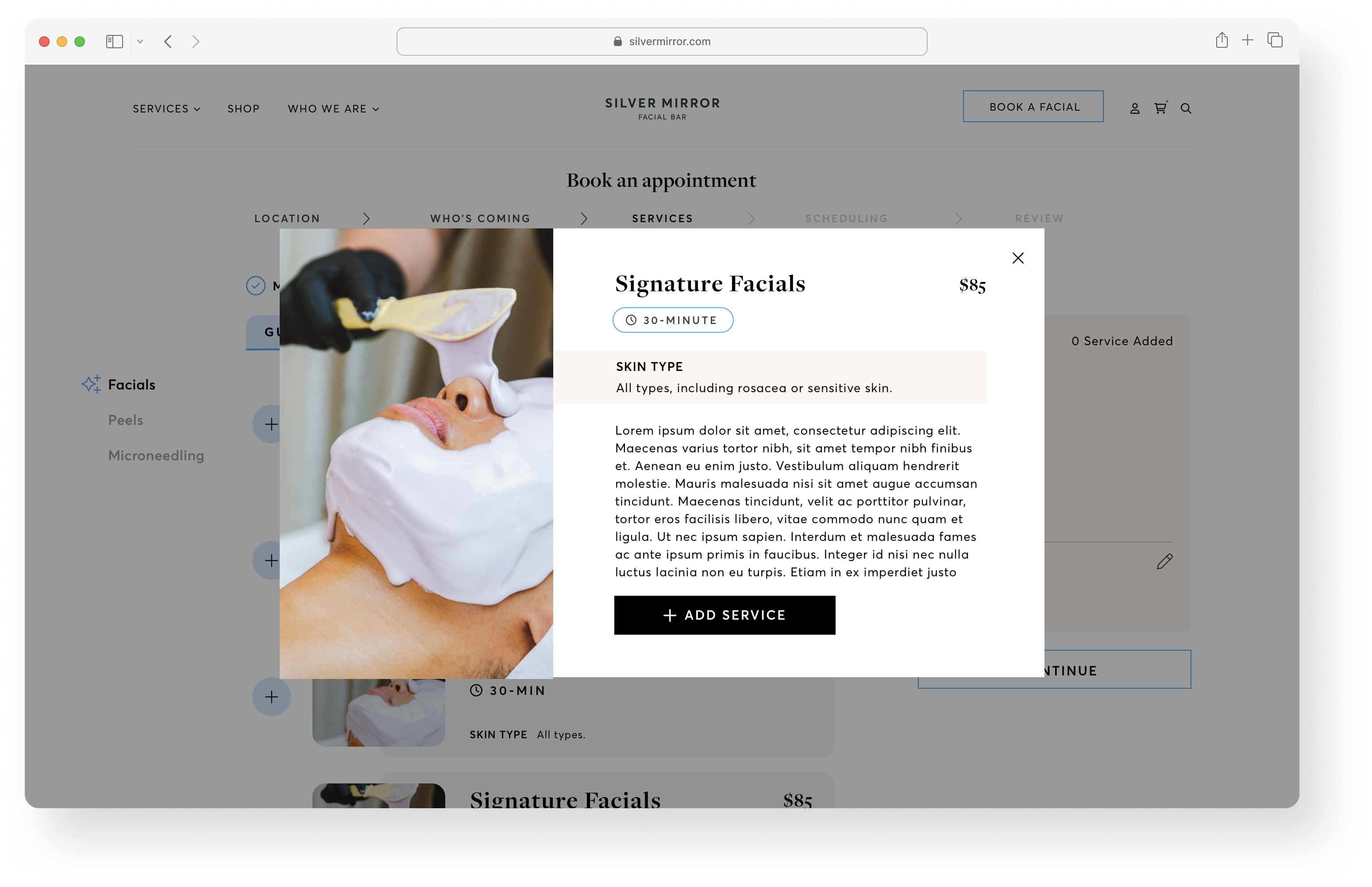
Service options were clearly categorized under tab menus, and micro-interactions like notification toasts were brought into execution in order to make the experience even more seamless and friendly.
Mid-fi Screens of the booking flow [Step 3] Services
![]()
![]()
Personal and thoughtful
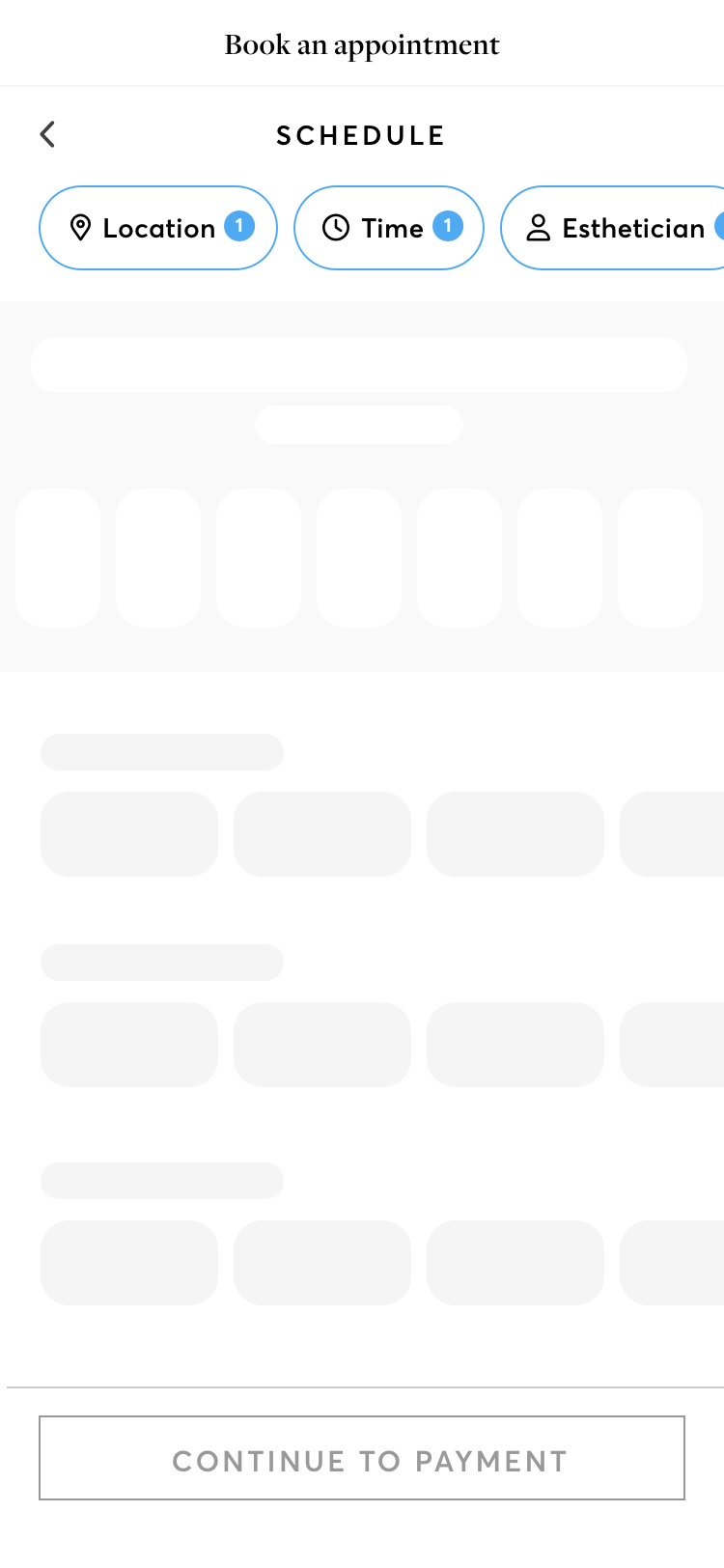
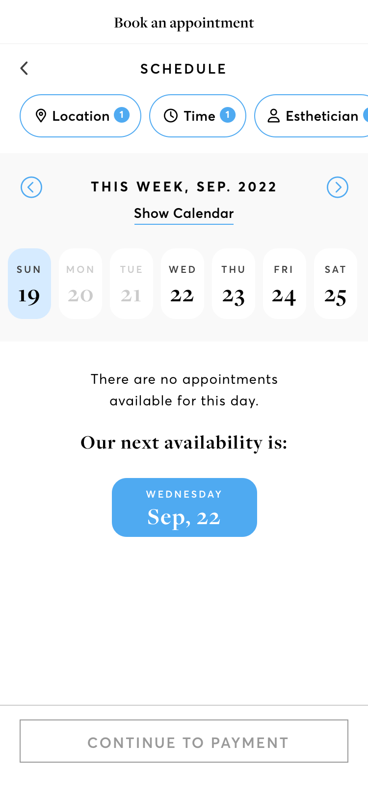
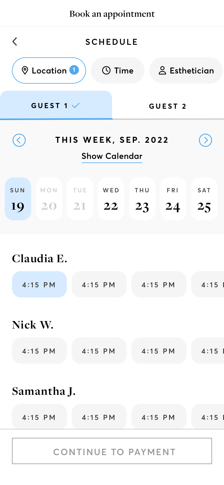
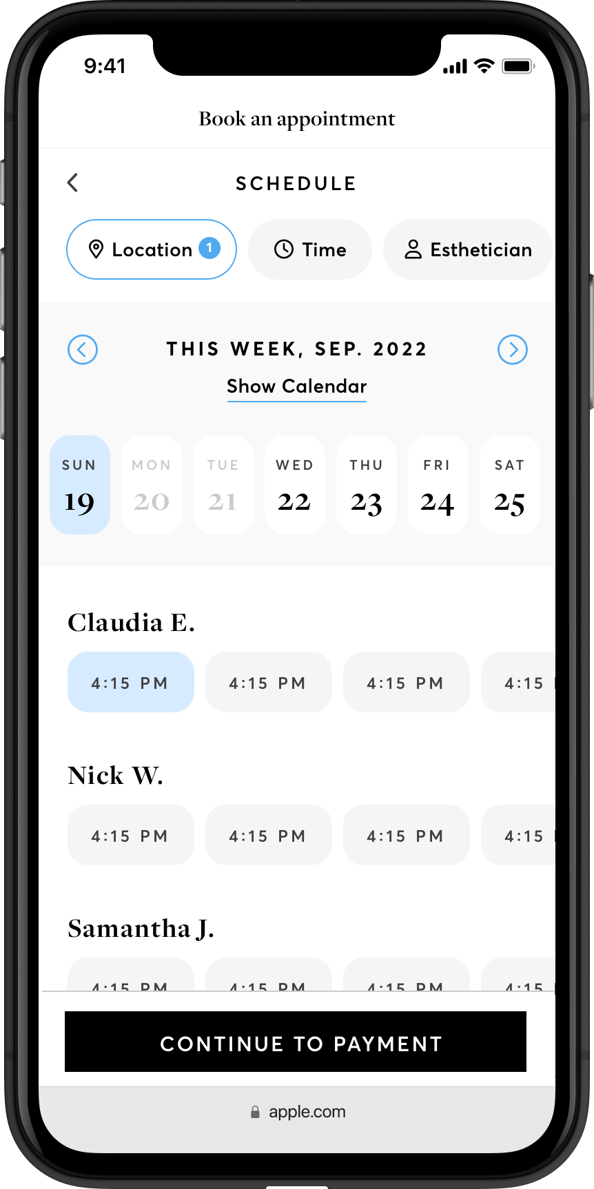
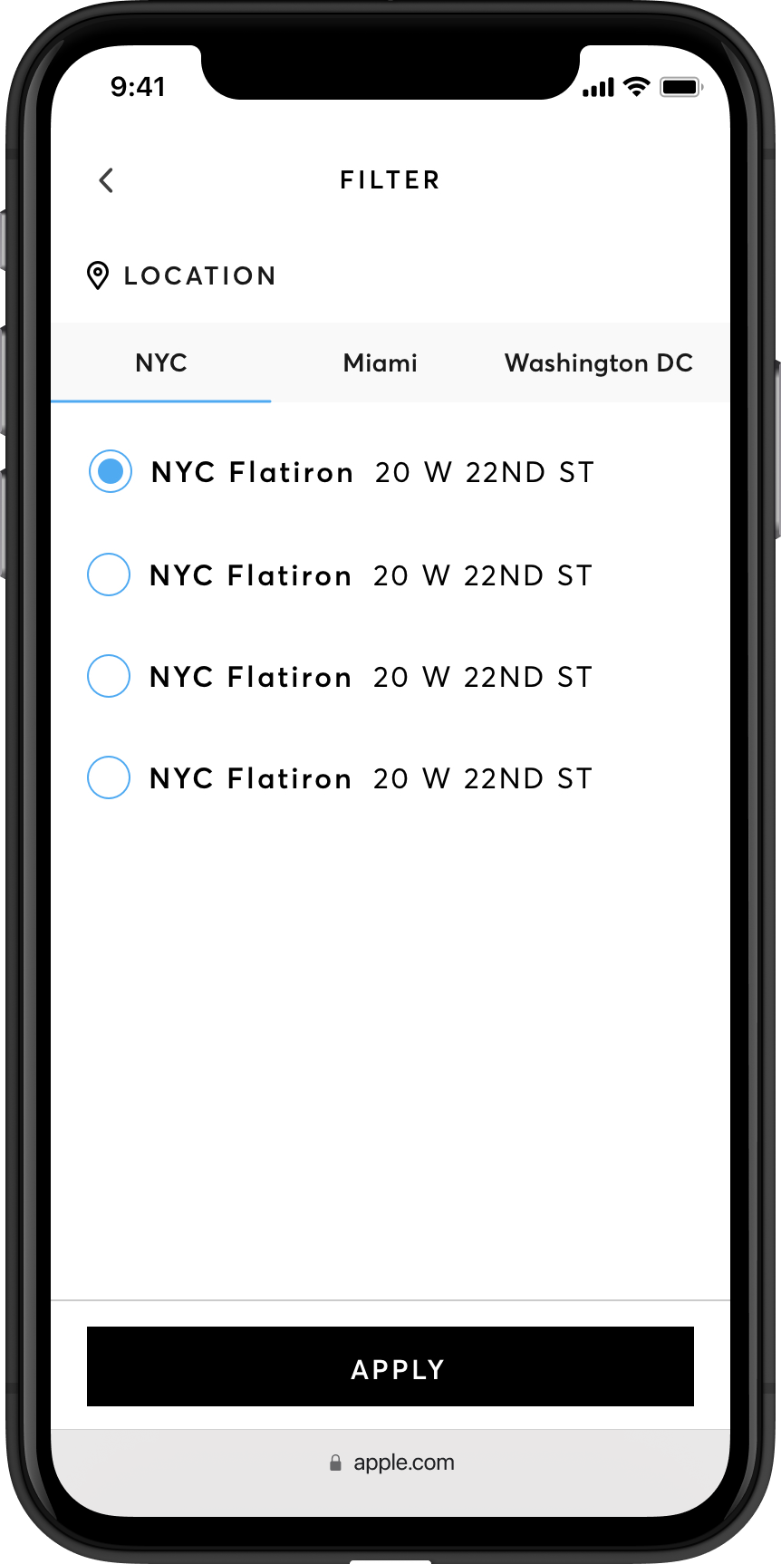
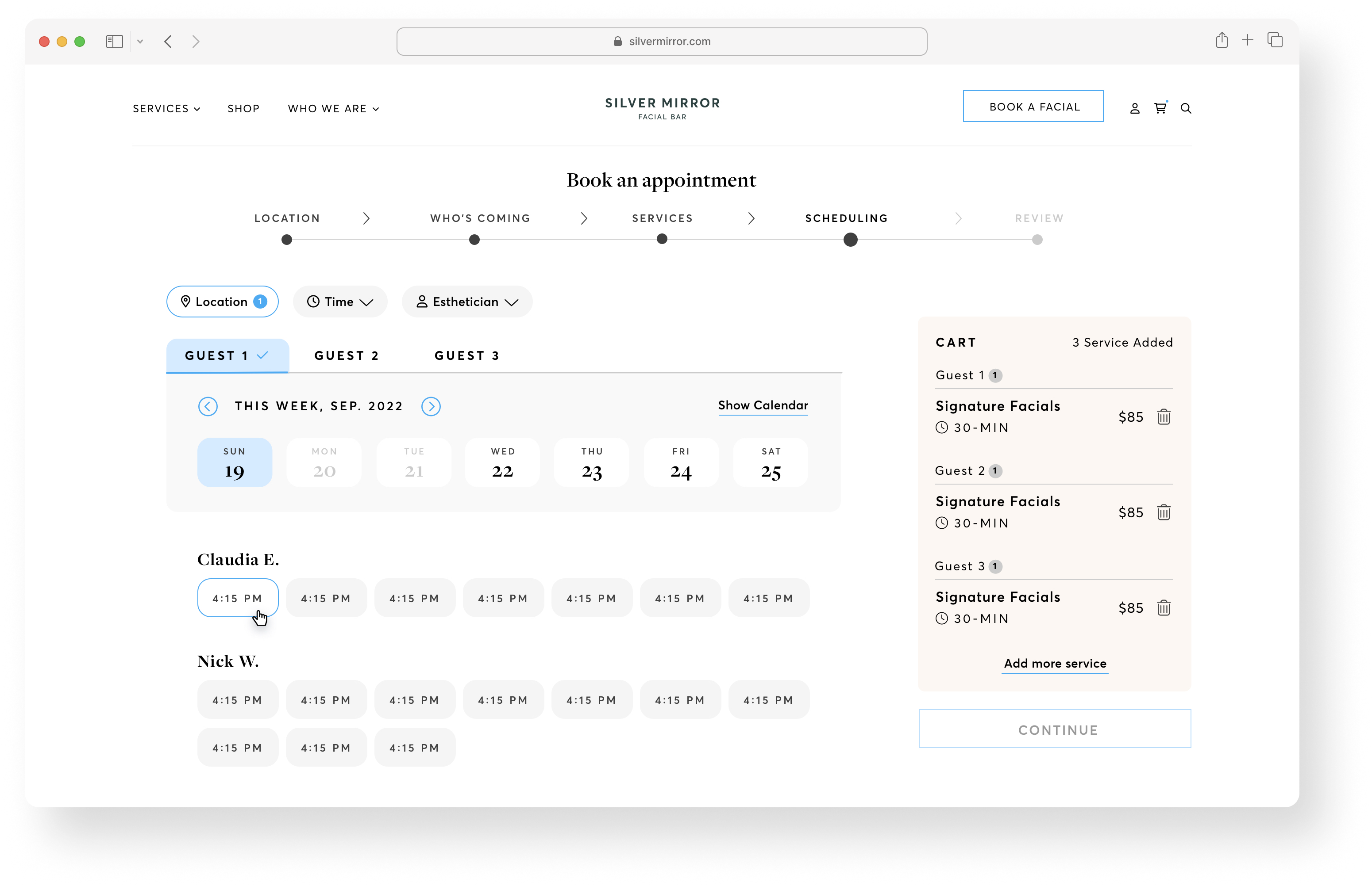
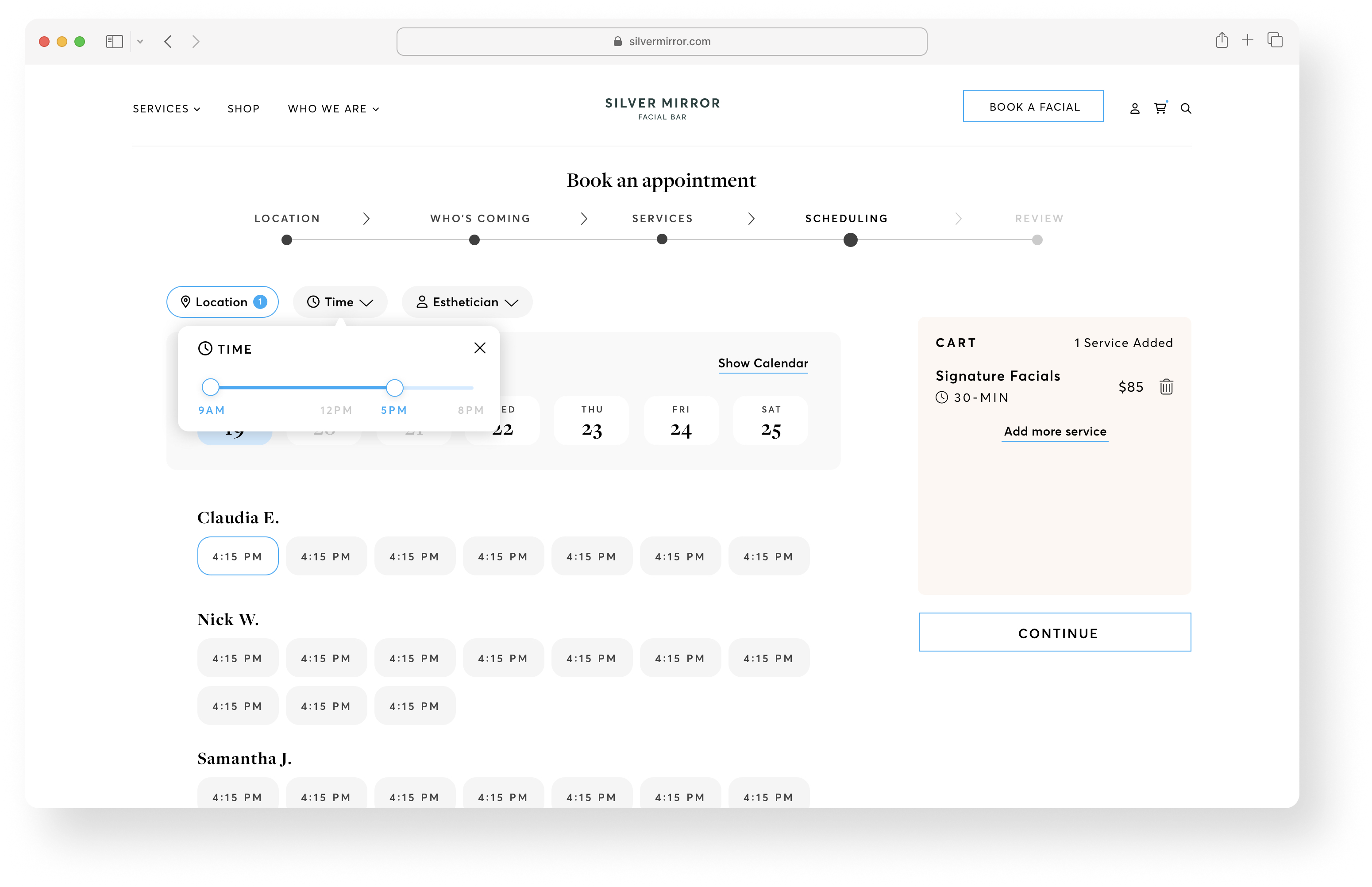
To meet our client’s needs, I brought the filters to the highest level of visibility. Silver Mirror wanted to make sure users are able to filter by locations, time slots and estheticians when scheduling an appointment.
Mid-fi Screens of the booking flow [Step 4] Scheduling
![]()
![]()
Mid-fi Screens of the booking flow [Step 3] Services
Personal and thoughtful
To meet our client’s needs, I brought the filters to the highest level of visibility. Silver Mirror wanted to make sure users are able to filter by locations, time slots and estheticians when scheduling an appointment.
Mid-fi Screens of the booking flow [Step 4] Scheduling
3. RESPONSIVE WEB DESIGN
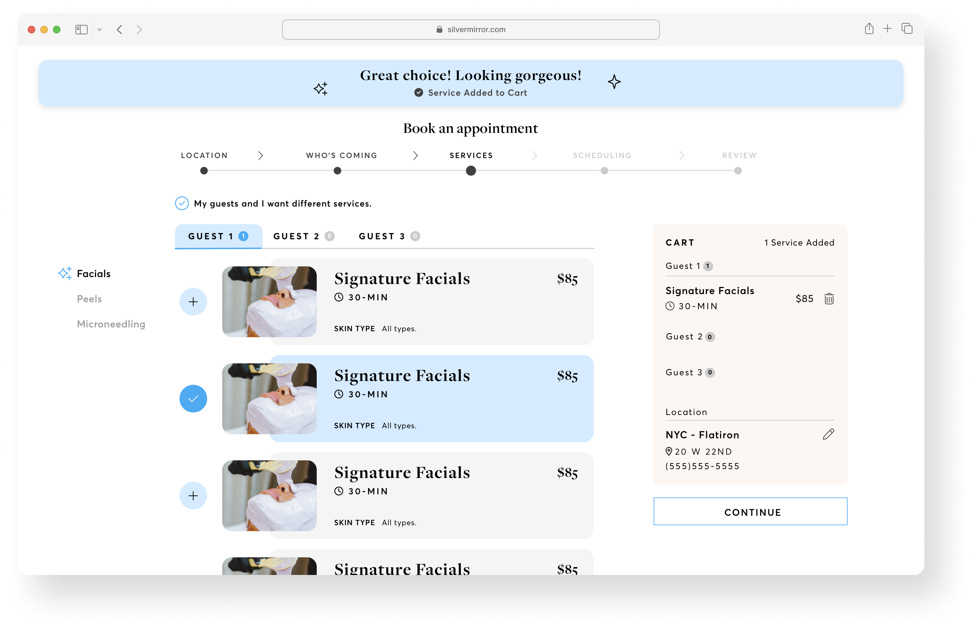
Mobile first, scaleble to desktop view
![]()
![]()
![]()
![]()
Mobile first, scaleble to desktop view
Egdecases
