
Apple Notes Redesign
Redesigning the native app, Notes—to appease advanced note-taking on the go.
ROLE
UX researcher, UX designer, UI designer
SKILLS
Sketch, Information architecture, Interview, Landscape research, Competitor analysis, Usability testing, Wireframe, Prototype, Design system
TOOLS
Figma, Photoshop
UX researcher, UX designer, UI designer
SKILLS
Sketch, Information architecture, Interview, Landscape research, Competitor analysis, Usability testing, Wireframe, Prototype, Design system
TOOLS
Figma, Photoshop
YEAR / DURATION
2022 / 9 weeks
INSTRUCTOR
Sally Chung, Ian Abinoja
2022 / 9 weeks
INSTRUCTOR
Sally Chung, Ian Abinoja
OVERVIEW
As one of the native apps, the biggest advantage is the high accessibility within Apple’s product system. Naturally, users' behavior ranges from quick note-taking to more complicated usage.
However, users who take advanced notes are found unsatisfied with the restraints while other advanced note-taking apps are difficult to navigate. The redesign has executed a simplified journey, improved the approachability of iPhone, and provided customization opportunities.
 PAIN POINT 1
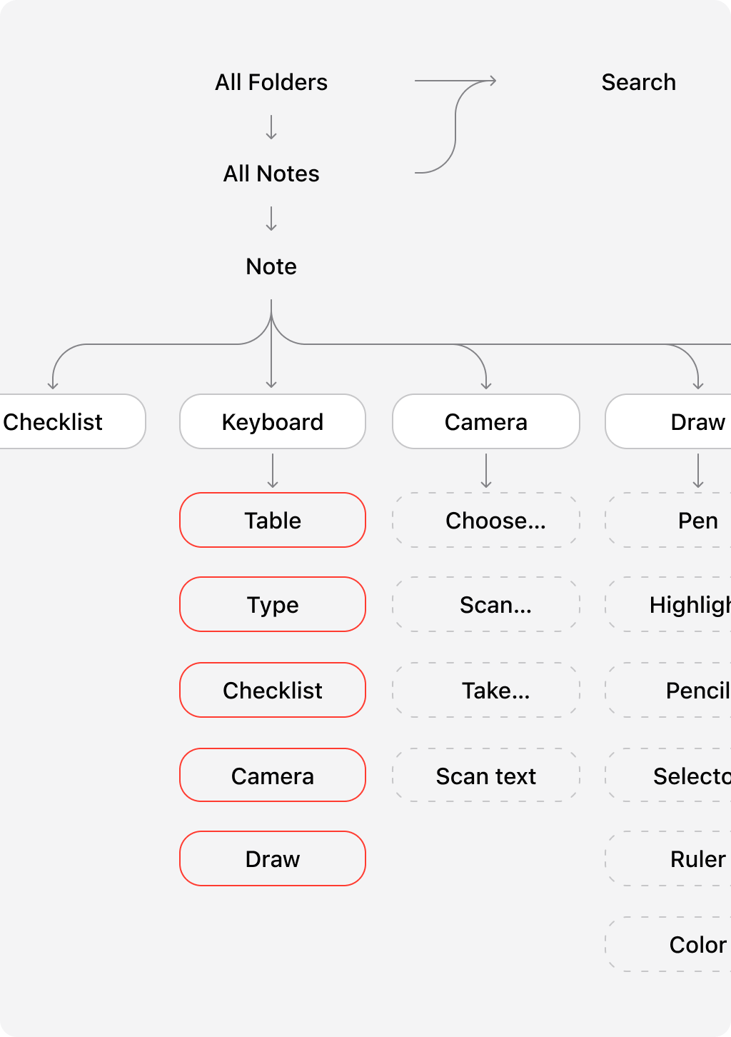
Confusing IA
 PAIN POINT 2
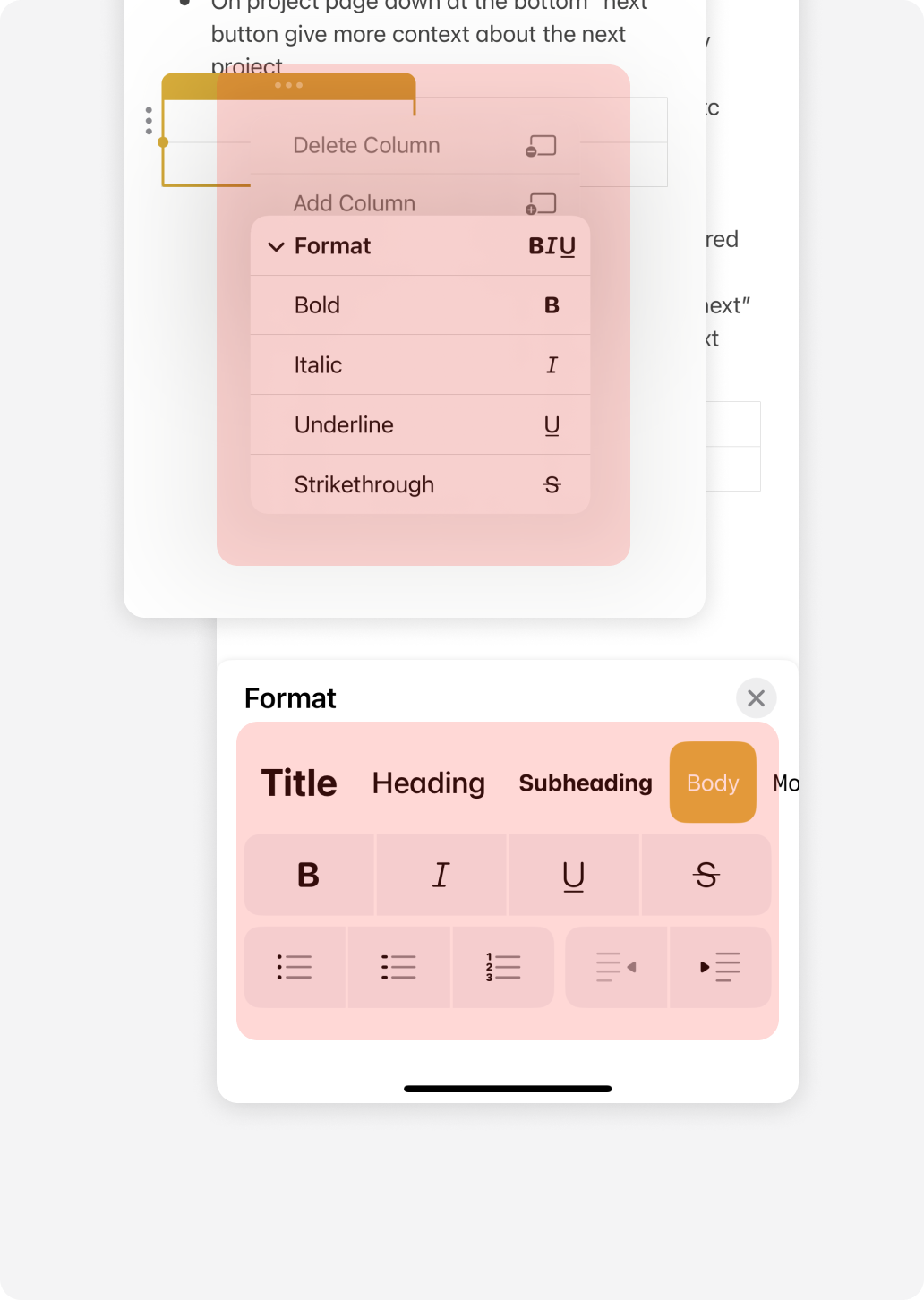
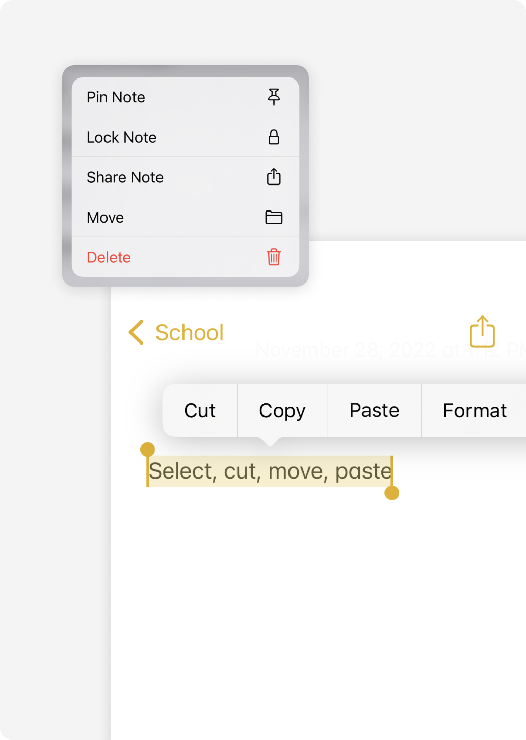
Editing Restraints
 PAIN POINT 3
Unproductive Flow
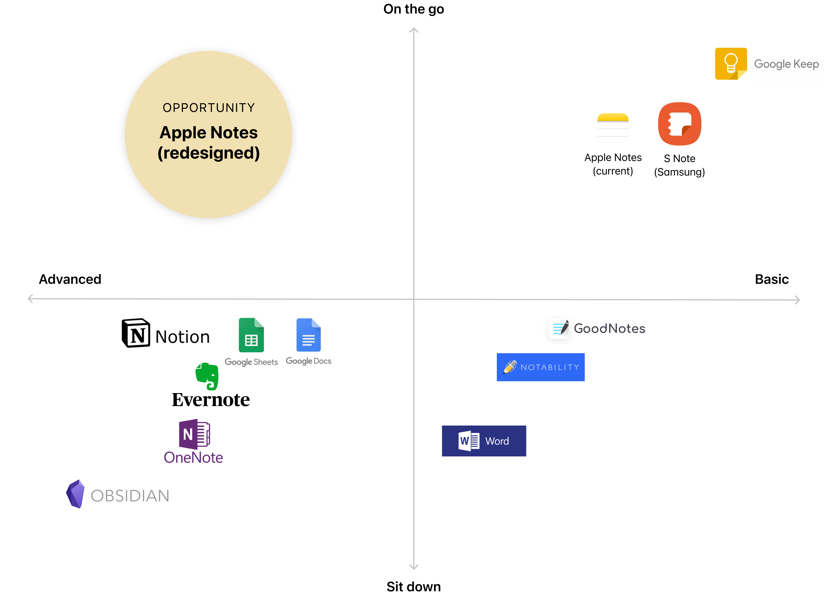
Market Opportunity
UX Audit & Journey
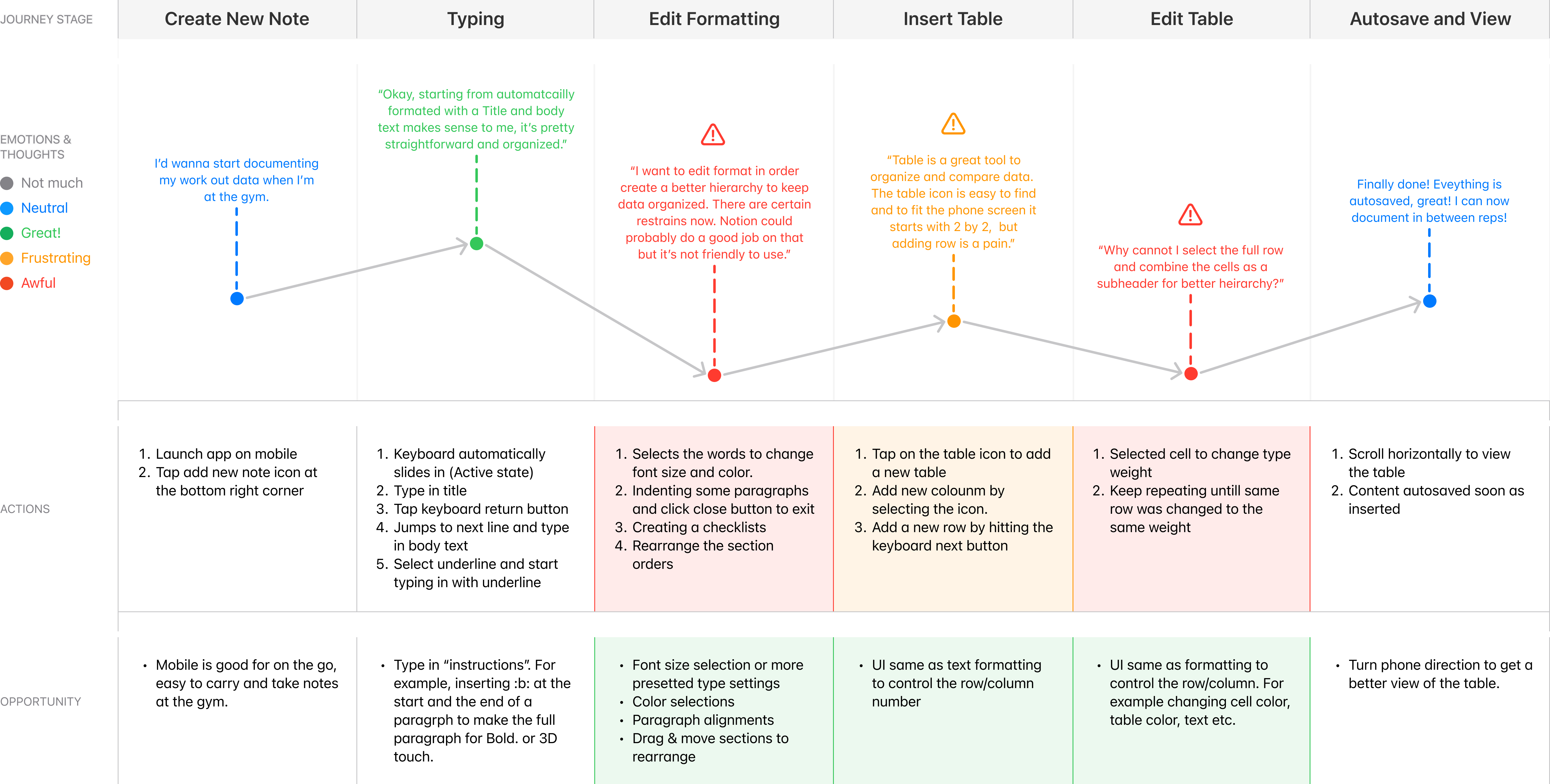
 SOLUTIONS ON PAIN POINTS 1 & 2
Improving the current problems
REACH ME ATworkwelaine@gmail.com
workwelaine@gmail.com
Linkedin
Instagram
Copyright © Elaine Shih 2024. All Rights Reserved