Stationery Addicts
An approachable responsive e-comm site selling aesthetic stationery, while providing knowledge.
ROLE
UX researcher, UI designer
SKILLS
Responsive website design, E-commerce, Sitemap, Landscape Research, Wireframe, Prototype, Design system
TOOLS
Figma, After Effects, Photoshop
UX researcher, UI designer
SKILLS
Responsive website design, E-commerce, Sitemap, Landscape Research, Wireframe, Prototype, Design system
TOOLS
Figma, After Effects, Photoshop
YEAR / DURATION
2021 / 6 weeks
INSTRUCTOR
Gregory Siegal, Spencer Schimel
2021 / 6 weeks
INSTRUCTOR
Gregory Siegal, Spencer Schimel
OVERVIEW
Problem
Most of the stationery e-comm sites have a dull visual appearance and frustrate users to browse due to the overwhelming content and the complexity of the sitemap. Moreover, the lack of storytelling and takeaways decreases the users' connection to the brand.
Most of the stationery e-comm sites have a dull visual appearance and frustrate users to browse due to the overwhelming content and the complexity of the sitemap. Moreover, the lack of storytelling and takeaways decreases the users' connection to the brand.
Goal
Learning the UI/UX patterns from observing e-comm sites, to build Stationery Addicts as a mobile-first, RWD site, that sells aesthetic stationery with a friendly online shopping experience, while providing knowledge about daily tools and stationery brands.
Learning the UI/UX patterns from observing e-comm sites, to build Stationery Addicts as a mobile-first, RWD site, that sells aesthetic stationery with a friendly online shopping experience, while providing knowledge about daily tools and stationery brands.
Sitemap


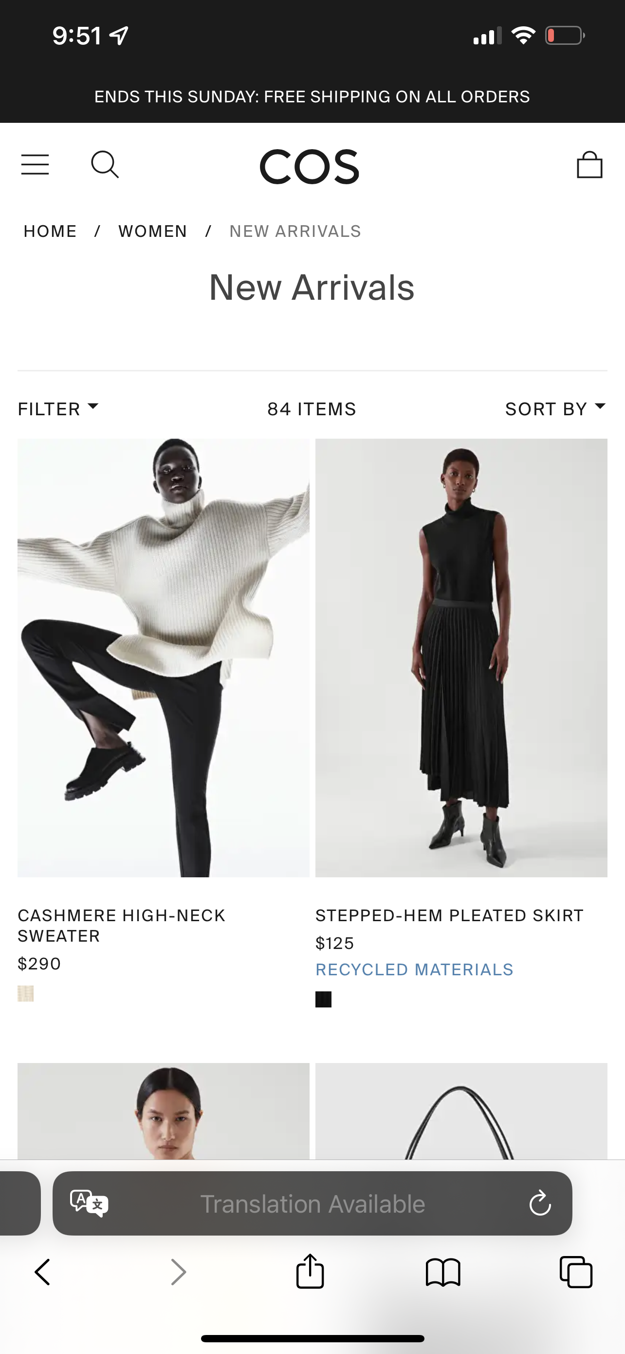
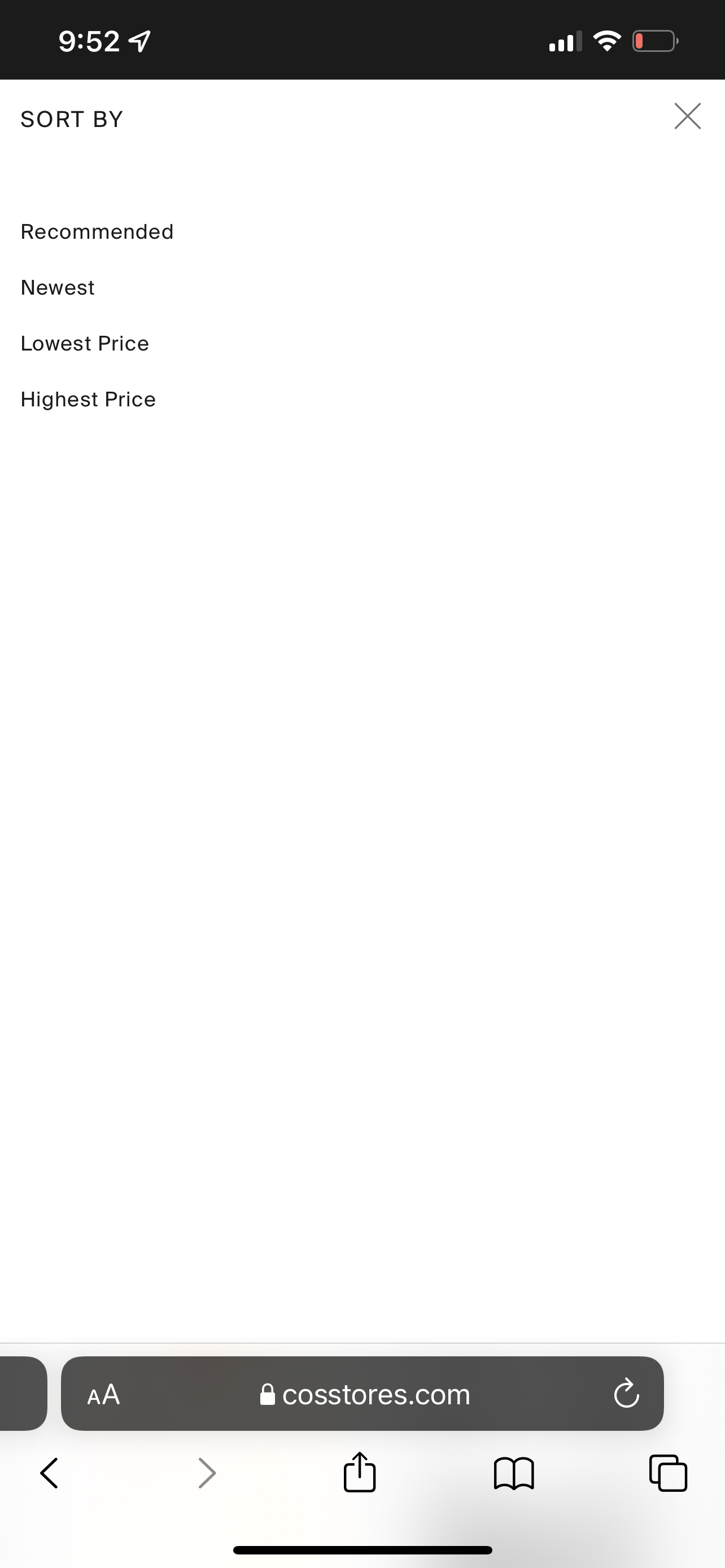
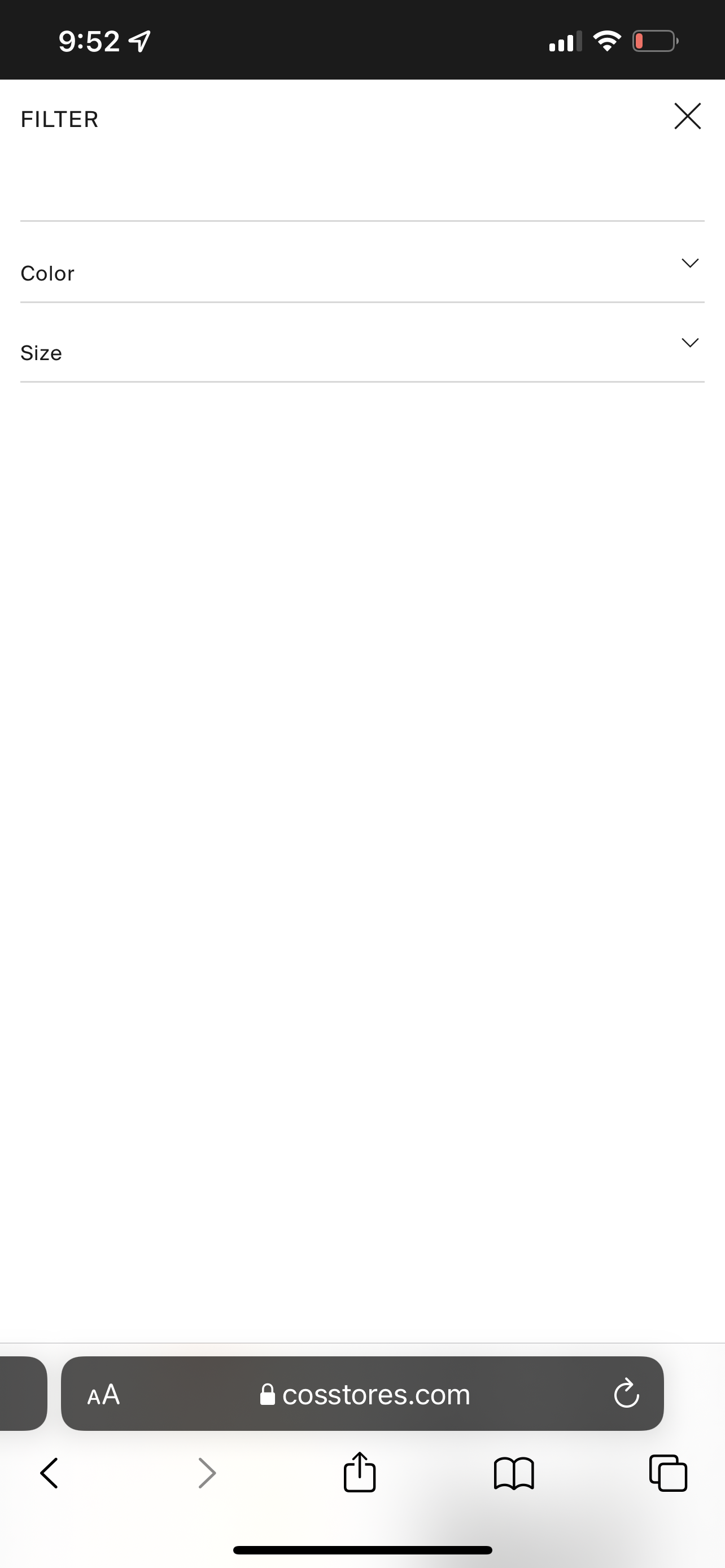
Browsing Page
![]()
![]()
![]()
Product Detail Page
![]()
![]()
![]()
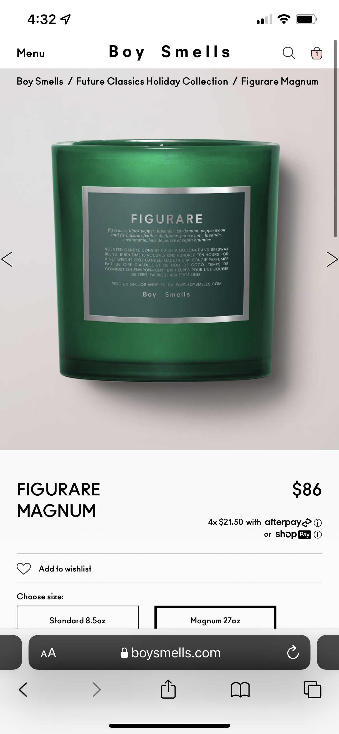
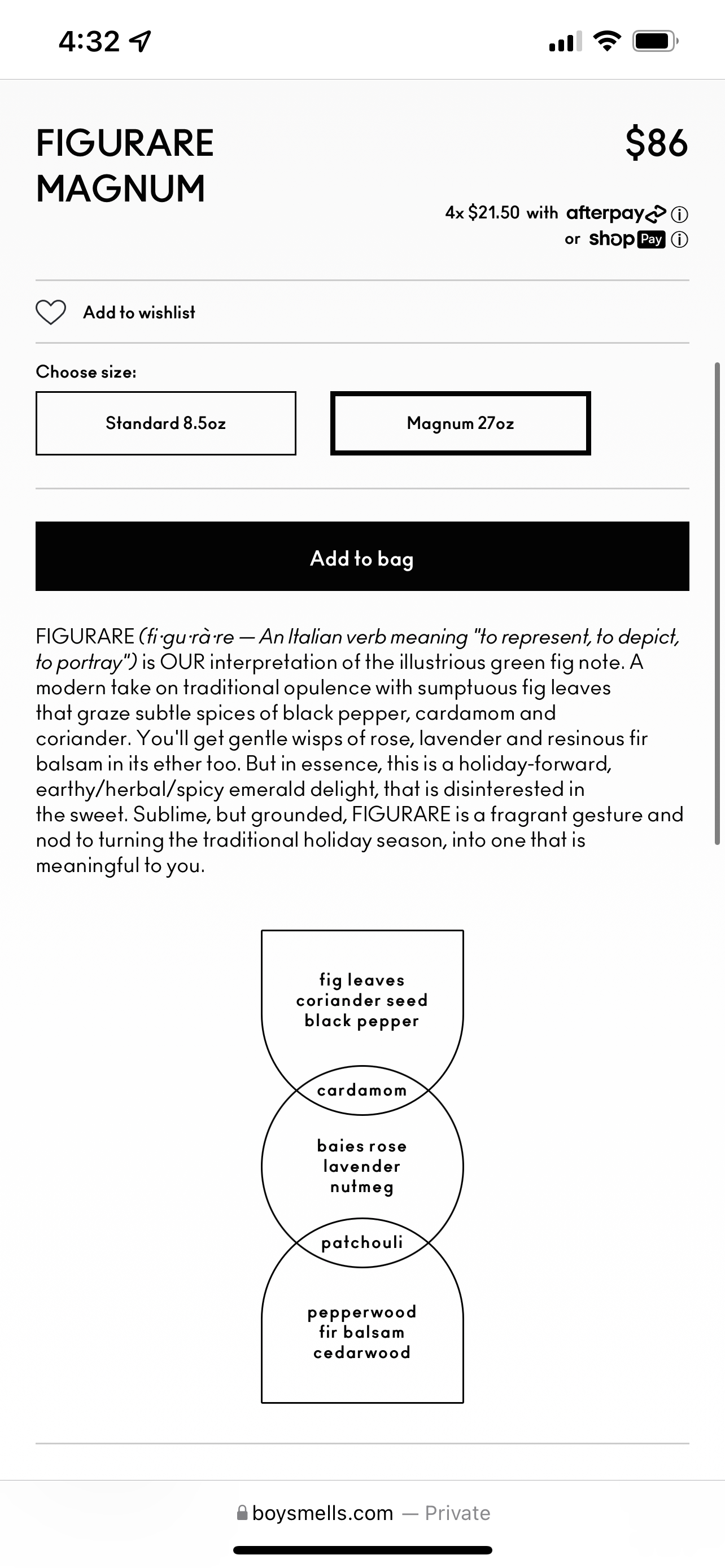
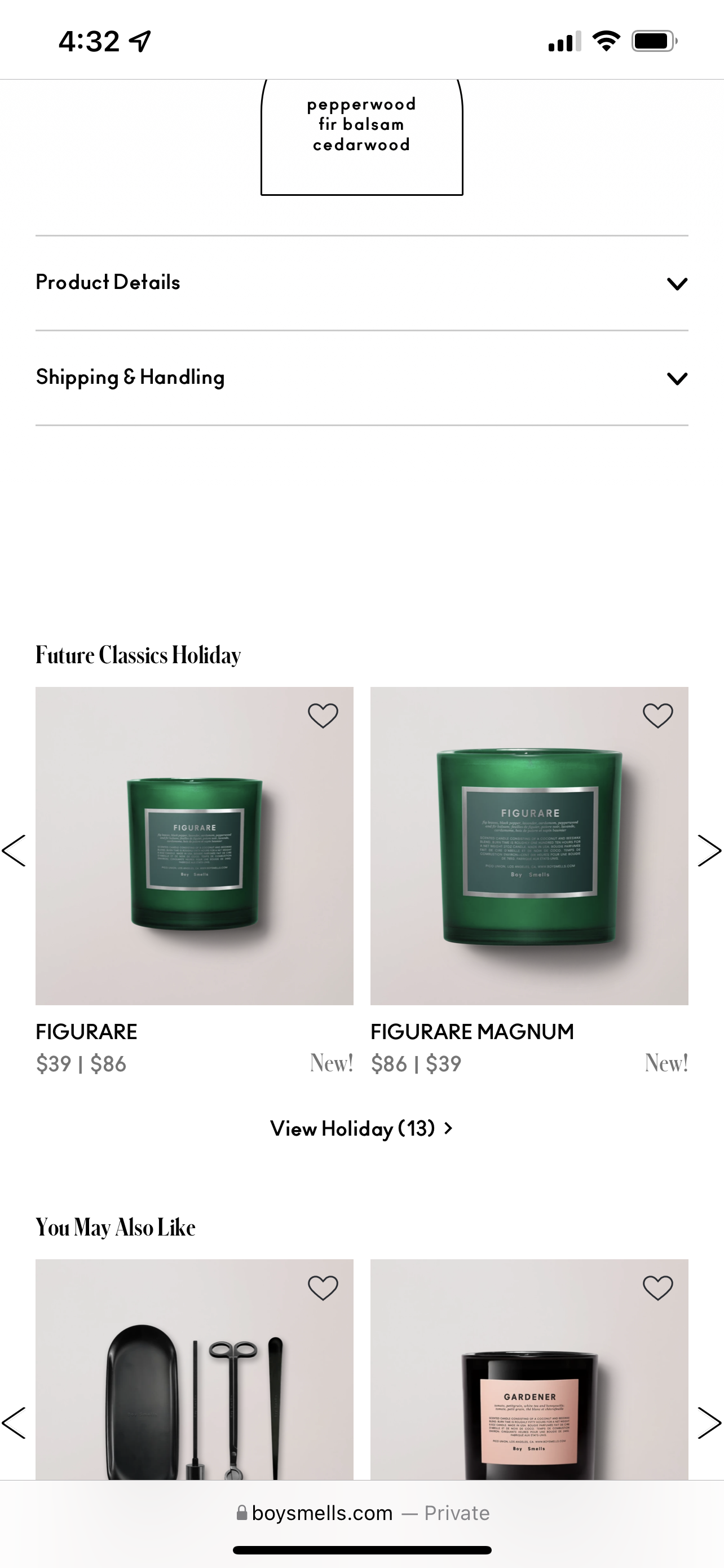
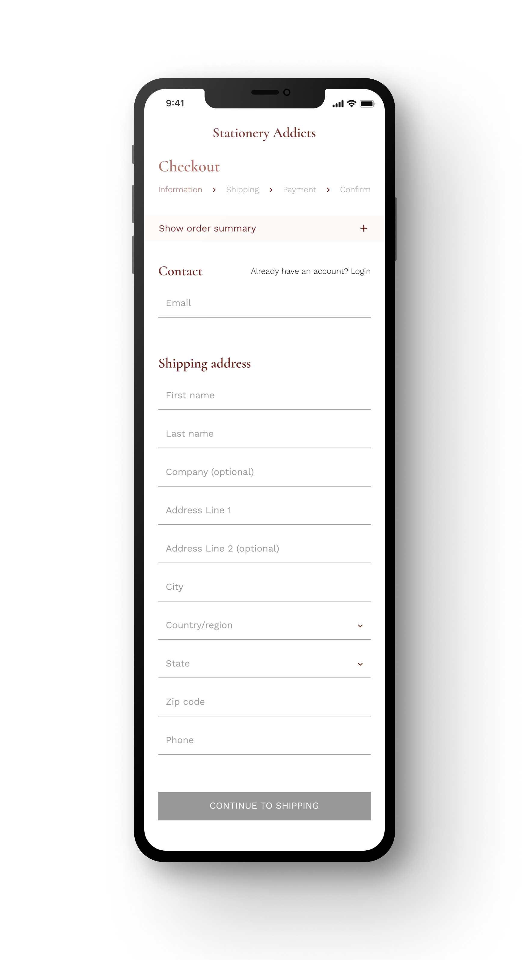
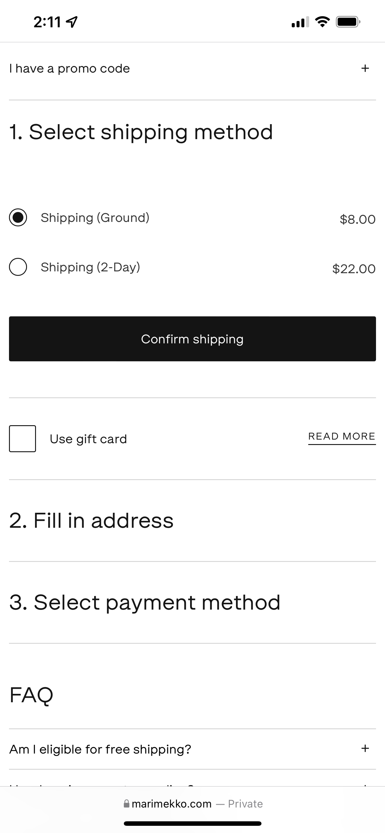
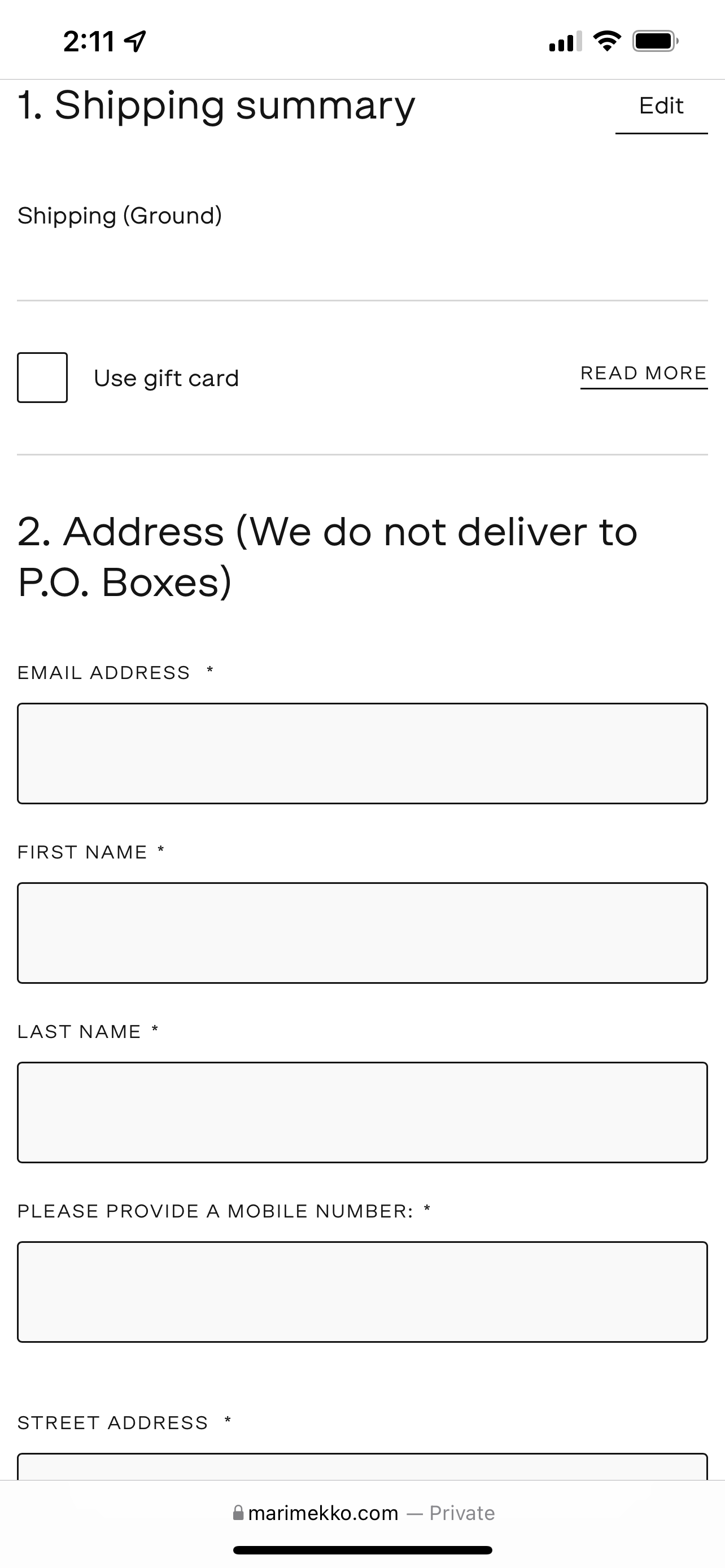
Checkout flow
![]()
![]()
![]()
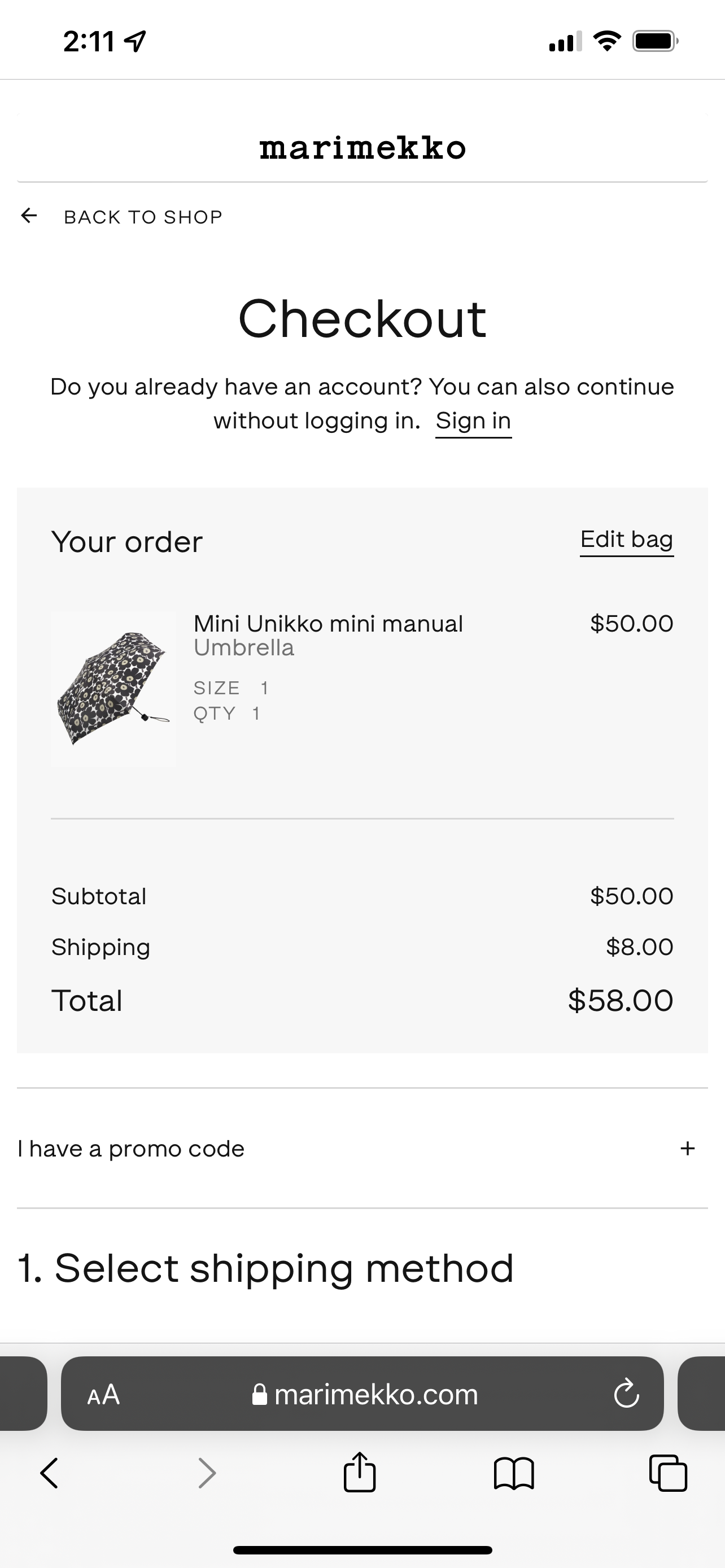
Stationery Addicts is an e-comm site selling well-designed aesthetic stationery products from all over the world. It is all about addiction and passion for stationery.
Structured Sitemap
Product browsing pages are organized based on product categories, brands, and business decisions, in order to be easily explored by users.
![]()
Product browsing pages are organized based on product categories, brands, and business decisions, in order to be easily explored by users.
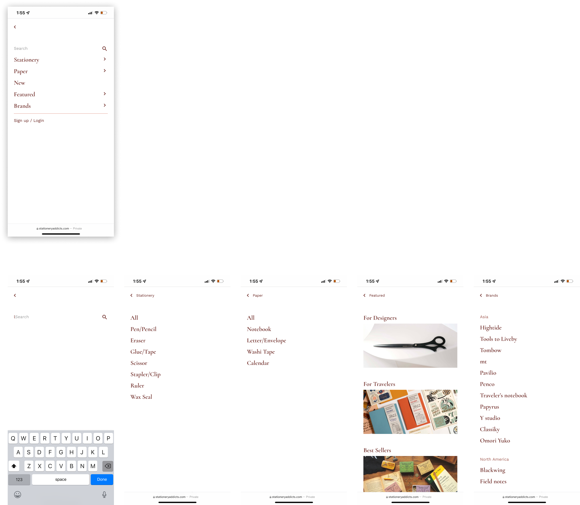
Learn behind the scenes—Site Menu
Takeaways for users to know more about stationery. Users can easily shop by brands while having a deeper knowledge of the products and learning their origin.
![]()
![]()
Takeaways for users to know more about stationery. Users can easily shop by brands while having a deeper knowledge of the products and learning their origin.


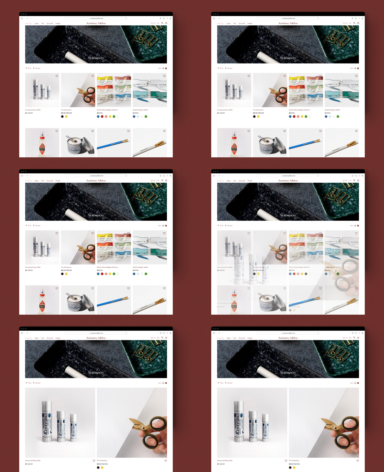
More appetite—Browsing Page
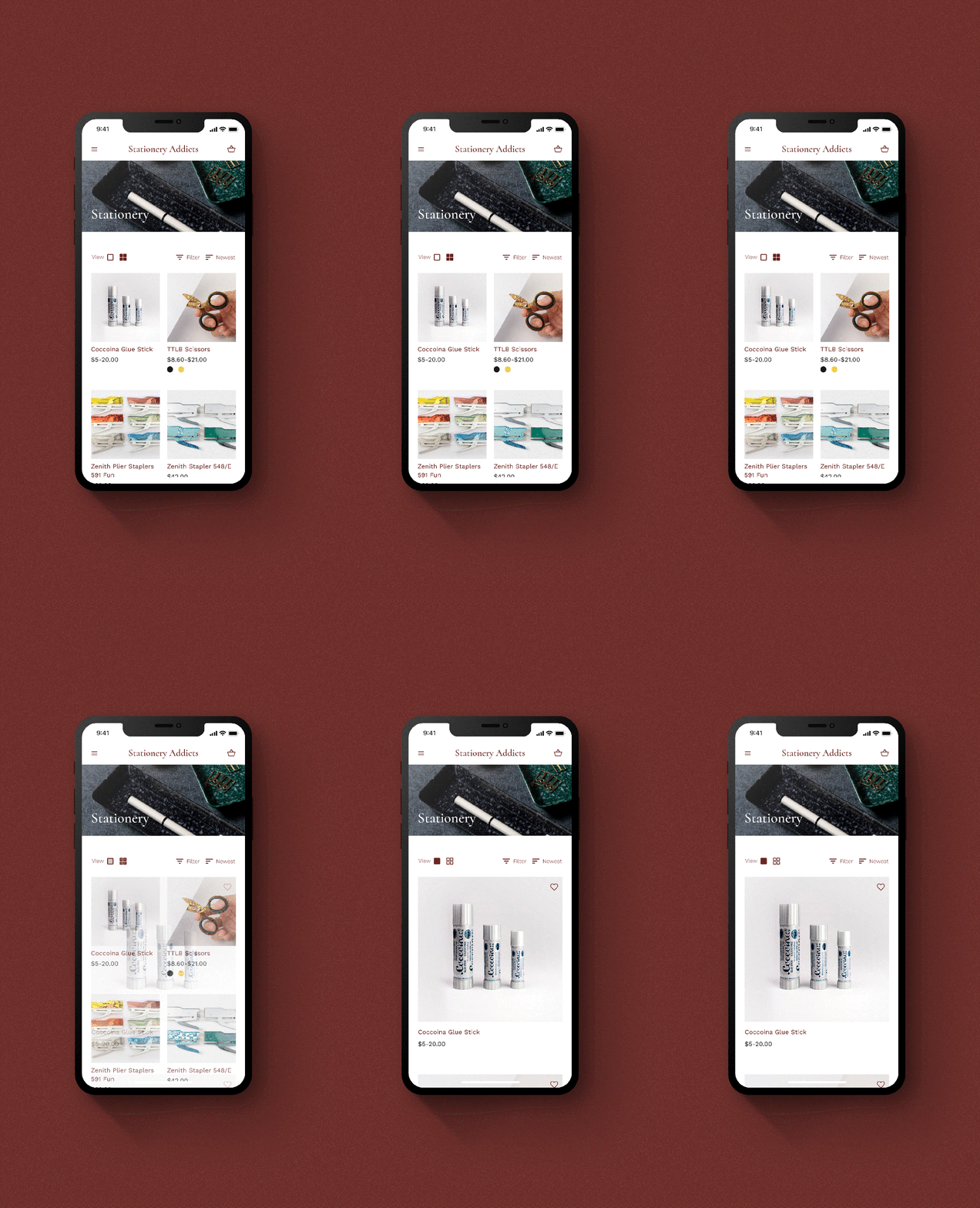
People have different preferences and needs. A small but useful feature, to switch view modes, is also included to serve a variety of users.
Simple without missing out—Product Detail Page (PDP)
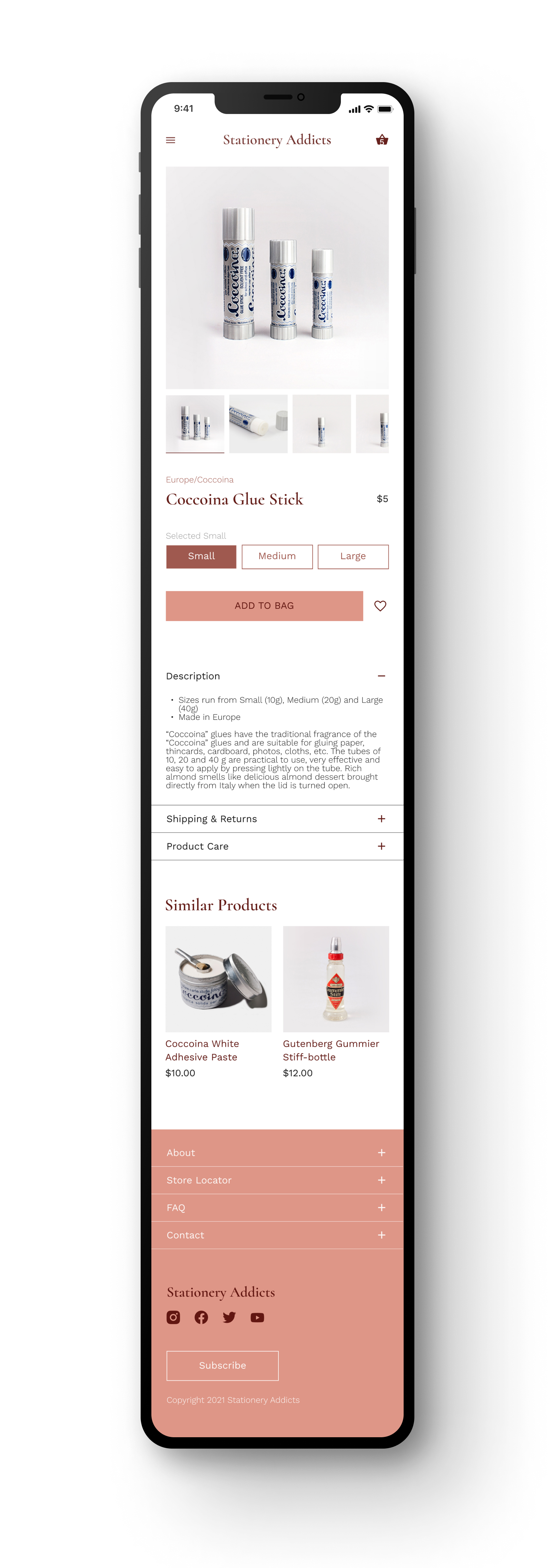
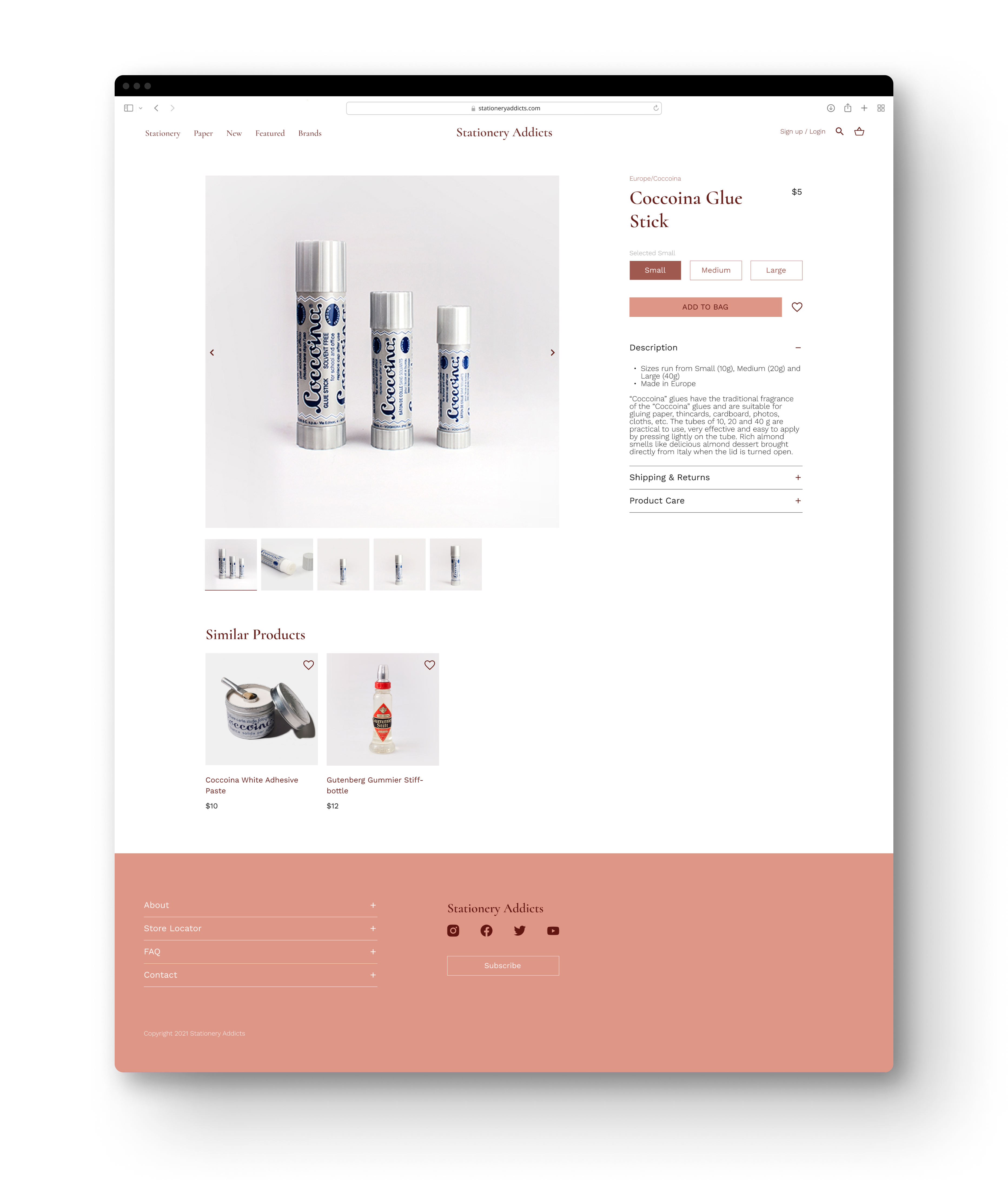
The PDP is designed with a clearer layout, prioritizing information for a better experience on different devices.
Less is more—Checkout Page
People are often bothered by long and complex field forms, so the goal of designing the checkout flow is to create an easy experience.
People are often bothered by long and complex field forms, so the goal of designing the checkout flow is to create an easy experience.
